Xfinity
Xfinity Rebrand
Senior Motion Designer, Sky Creative Agency
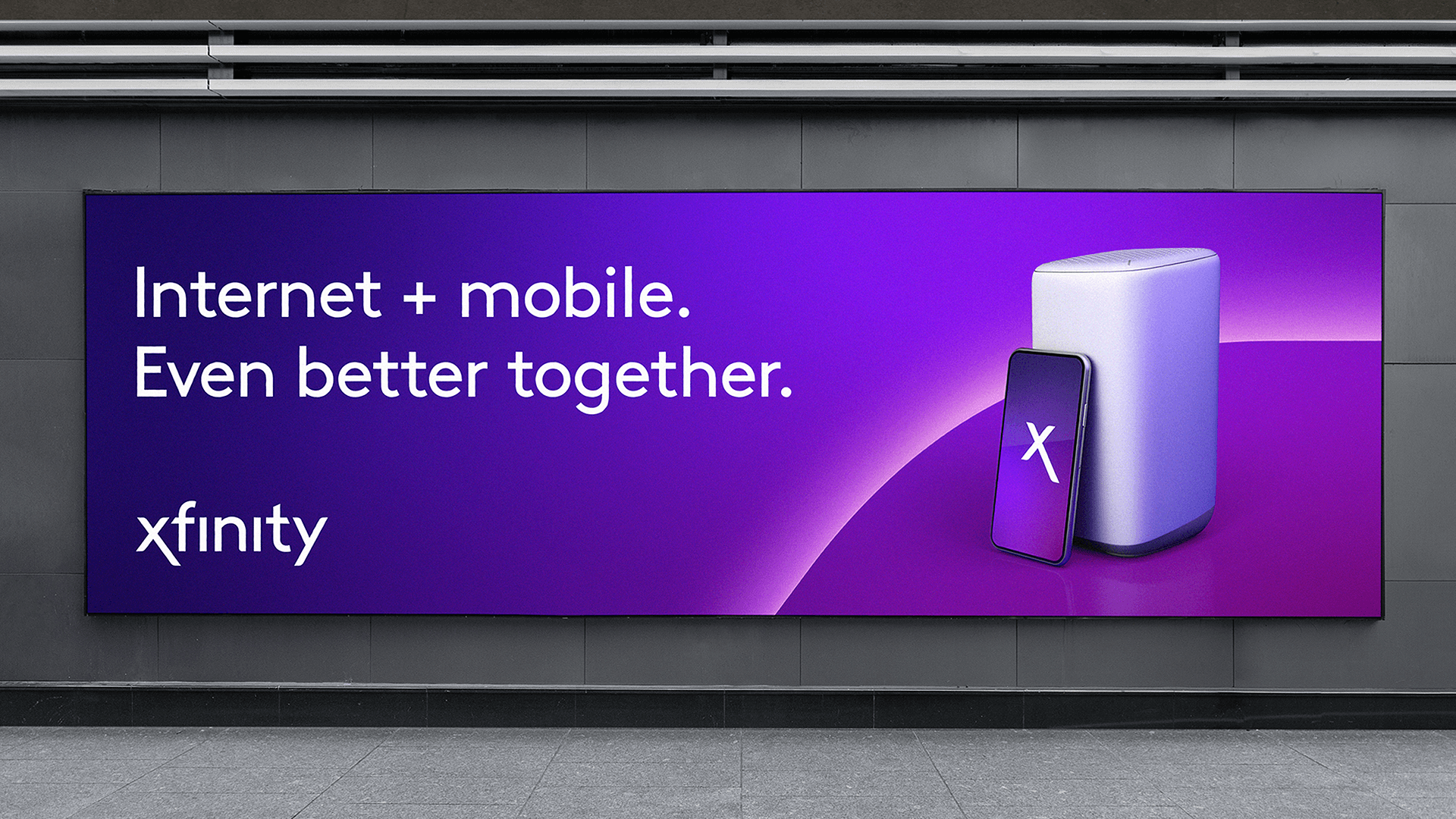
Working closely with Creative Director Mark Jones, we developed a brand device for US Cable & Telecoms company Xfinity. A household name in the states but less well known in the UK, this was a fantastic opportunity to elevate a brand that - at that time - had only a very basic suite of branding elements in it’s kit of parts. I explored the idea that Xfinity was a multi-faceted, multi-layered offering. This led to looking at layered folds and peeling. These early style frames created in Cinema 4D and Octane led to further exploration work where we began to look at animation.


I built and animated motion tests based on these style frames
The tests focused around the X having multiple layers, like an onion skin. Each layer was representative of a part of the business - or the idea that more is happening behind the scenes. This basic premise provided a suitable jumping off point for what became the ‘pages’ mechanic - the folding of the X logo. This would eventually lead to the final animated marque, rolled out across all touchpoints.
Refining the final animation
Cycling through the pages of the X folded in half, it then resolves and then melts away. It felt like an elegant evolution of the current brand - a fleeting glimpse of a more complex world, before we resolve to a simple marque. This mechanic has a multitude of uses - from promo intros to endboards, wipes and a variety of motion branding.
Having designed and built the animated X asset, we set to work implementing it across numerous touchpoints
There was further development of end boards, layout, typographic animation styles and all manner of brand OSP and messaging.